CiteSeeing (english)
What is this about?
CiteSeeing is a program intended to create citations from books on decorated background as a sharepic for social media. It is inspired by Canva but using LaTeX and also by SPBuchsatz by Karl-Heinz Zimmer, a LaTeX based software to typeset German books.
Link to the software with installation guide and such.
If you come from SPBuchsatz, a software to typeset German books, you might already be familiar with the concept of CiteSeeing since it works in a very similar way.
Some neat examples
Here you see some examples for sharepics I create with this software. They will come up in this article when you know the settings to make them.

Main Drawbacks
CiteSeeing produces files of type pdf, not images. You will have to convert the images. You can use gimp, krita, most other software to create or modify images, or a converting tool like magick. I use
magick -density 300 input.pdf output.png
on command line.
Do you need help?
If you have trouble with this software, please don’t hesitate to ask me. I am a patient person and like to explain. My benefit is: I find bugs and know that my software is used. I learn how to make my software more user friendly.
Maybe at some point, when too many people use this software, I will limit this offer somehow, but for now feel free to ask.
You may also wish for more comments or explanations here or in the code.
You even may ask for features but that will take a while which even might be forever, depending on my time and the wish.
Presets (technical)
You create a sharepic from a file where you make your choices for colors, decorations, and text. A minimal file, where you choose nothing yourself, looks like this:
\input {preamble.tex}
\input {montage.tex}
It creates the following image:

This is because there are some minimal presets made (in defaultdefinitions.tex). To be precise
it
- unsets every decoration,
- defines the text like that in the image above,
- defines four colors (from which you only see two in the image above, the foreground and the background color, since there are no decorations),
- defines text width and line spacing,
- and defines some specifics of decorations in case you choose them but don’t fineadjust them yourself.
A reasonable example
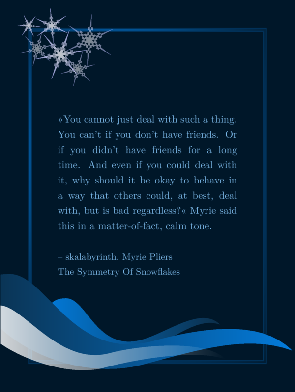
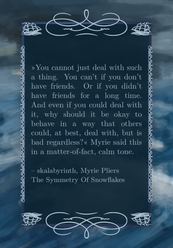
The file SharePic.tex however is a file where every choice, you can make, is explained, and it creates this
reasonable SharePic with my favorite quote (I only changed the language of the content of ‘\csquote’ and ‘\csauthor’ for this English article):
You can copy this file to MySharePic.tex or any other name you like, modify its content and
create a sharepic in your own design. Probably that is all you need to know, but this article
is more verbose in its explanations and also shows examples.
Every feature explained with example sharepics
In this long section I will introduce every feature with examples, explanations and special tricks.
Basic Features
Colors
Colors can be defined via html code. If you use krita or gimp and choose a color (in krita via the color selection in the menu), you will be shown the html code in the selection tool (a six digit number probably preceded by a #). You can also use your favorite search engine and search for something like “html color picker” and use one of the websites you find. Be sure to do your research on accessible contrasts and colors for colorblind people.
I usually use more or less the same color in different shades and a contrast for text on background, that is as high as possible while it still doesn’t hurt my eyes.
There are four colors for you to define:
A background color, used for background and decoration:
\def \bgcol {001729}
A foreground color, used for text and decoration:
\def \fgcol {79b5e4}
And two additional colors also for decoration:
\def \mgcol {0c2f4a}
\def \mgcolb {037bdb}
The codes for the colors above would be the colors depicted in the following image:

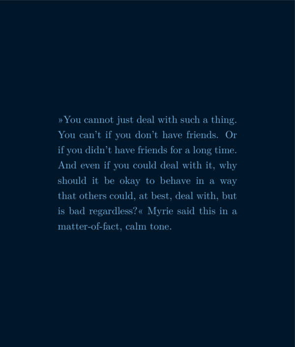
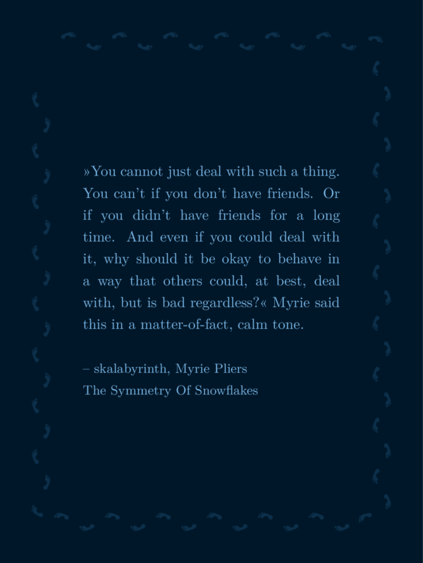
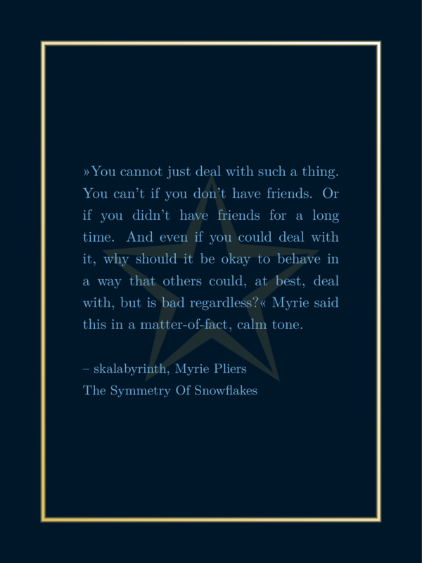
If you want to create a sharepic with just a background in one color and your text in another color, the following file would be sufficient:
\input {preamble.tex}
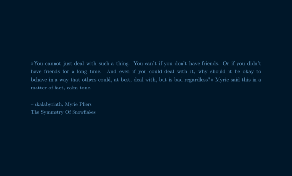
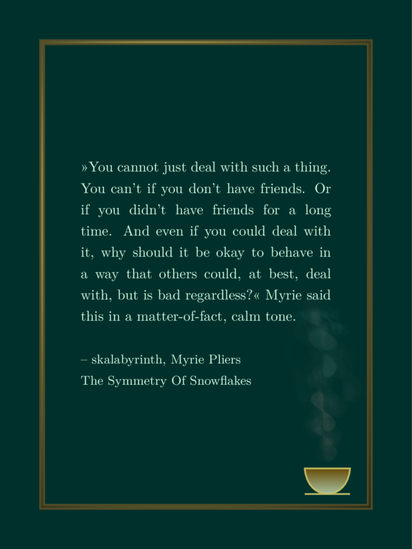
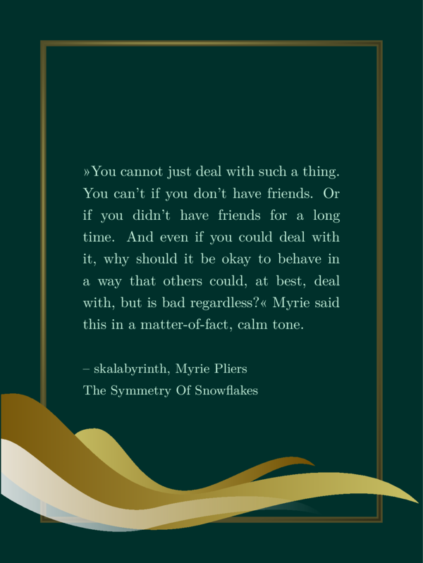
\def \csquote {»You cannot just deal
with such a thing. You can't if you
don't have friends. Or if you didn't
have friends for a long time. And even
if you could deal with it, why should
it be okay to behave in a way that
others could, at best, deal with, but
is bad regardless?« Myrie said this
in a matter-of-fact, calm tone.}
\def \bgcol {001729}
\def \fgcol {79b5e4}
\input {montage.tex}
and it would create the following image:
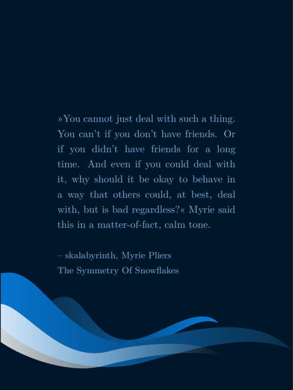
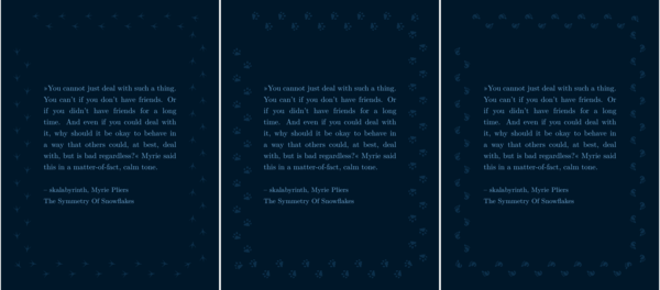
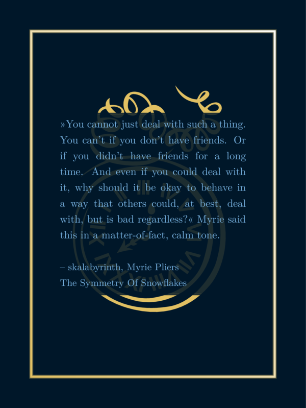
If you add some decoration the other two colors get into the game. For example you could choose
the droplet/wave like forms from the example above by selecting \csthreewaves with an ‘x’ (or basically
an arbitrary input other then leaving it empty) alongside with the other two colors:
...
\def \mgcol {0c2f4a}
\def \mgcolb {037bdb}
\def \csthreewaves {x}
...
(or \def \csthreewaves {fleatherfluff} if you want – the exact input has no effect). It would create the following file:

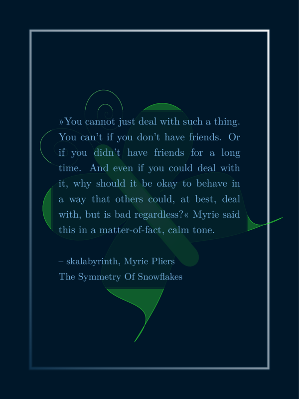
If you switch mgcol and mgcolb like this
...
\def \mgcolb {0c2f4a}
\def \mgcol {037bdb}
\def \csthreewaves {x}
...
you get this sharepic:
Maybe this gives you an idea what effects these additional two colors could have.
Text, Author, Title, Heading
Maybe you remember that you can define your quote using \def \csquote {}: You write your quote inbetween the brakes like this:
...
\def \csquote {»You cannot just deal
with such a thing. You can't if you
don't have friends. Or if you didn't
have friends for a long time. And even
if you could deal with it, why should
it be okay to behave in a way that
others could, at best, deal with, but
is bad regardless?« Myrie said this
in a matter-of-fact, calm tone.}
...
If you have linebreaks in your citation in your settings file, but don’t leave a
line empty, it doesn’t have an affect the result. If you want to have a newline in
your output file, you can leave an empty line or end your line with \\.
Here a special trick: If you end it with \\[0.5em] you get a new line with a bit distance to the one before and
you control that distance with the number. Here an example. The code
\input {preamble.tex}
\def \csquote {First line.\\
Second line.\\[0.5em]
Third line.\\
Forth line.}
\input {montage.tex}
results in this output:

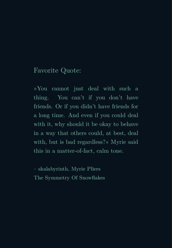
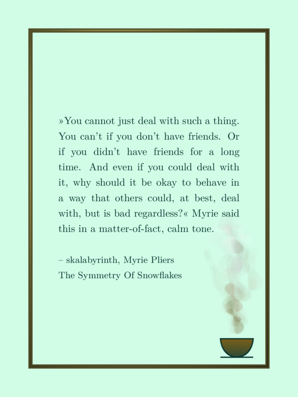
Apart from \csquote there are two other fields for text:
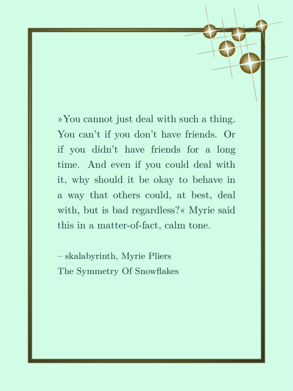
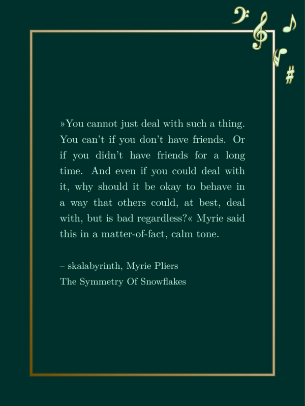
\csauthor{}: This field is intended to contain the name of the author and maybe the book or story the citation is from. It is printed below the citation, in a slightly smaller font size.\csheading{}: This field is intended to contain a heading like the book title, if you rather want it to appear above the text, or a project name like an anthology name or something like ‘winter challenge’ or ‘#PhantasticPrompts 6.12.’ or whatever. It is put above the text in a slightly larger font size.
Both fields can be filled with any text or left empty. The code
\input {preamble.tex}
\def \csheader{Favorite Quote:}
\def \csquote {»You cannot just deal
with such a thing. You can't if you
don't have friends. Or if you didn't
have friends for a long time. And even
if you could deal with it, why should
it be okay to behave in a way that
others could, at best, deal with, but
is bad regardless?« Myrie said this
in a matter-of-fact, calm tone.}
\def \csauthor {– skalabyrinth, Myrie
Pliers\\The Symmetry Of Snowflakes}
\input {montage.tex}
creates this sharepic:
Here are some special tricks: If you want to have italic text, you
can put the text into a command that creates italic text: \textit{example text}. Similar commands are:
- \textit for italic text.
- \textbf for bold text.
- \texttt for type writer style.
- \textunderline for underlined text.
- \emph for emphasising – it is dependend on the context, what it does.
You can nest several of these commands.
You can also experiment with the commands
\tiny, \scriptsize, \footnotesize, \small, \normalsize, \large, \Large, \LARGE, \huge and \Huge with
curly brakes around parts of the text to control font size, but this interfers with
predefinitions, so be careful. It might look bad or even result in errors.
Text width and line spacing
Despite what I just explained, there is no intended option to control the font size. That is because the output is a pdf file without a specific format like A5 or whatever. It is a vector graphic that you can scale to your needs.
There are however options to control the text width and the line spacing:
\def \cstxtwidth {6.2cm}
\def \cstxtspacing {1.5em}
A good choice for the text width is between 5cm and 30cm but you are free to try any value. It affects how wide your sharepic becomes.
There is one special case (so far): If you use a background image instead of a (potentially decorated) color background, the width of the sharepic is determined from that file instead from the text width. In that case text width should be chosen dependent on the width of the background image. Otherwise it won’t fit onto the page properly. You will need to experiment a bit. But it is wise to experiment with the text width depending on your text anyways: You may want to experiment with text width anyway, till the output does not result in a text with huge gaps between the words.
The units of the line spacing is dependent on the font size (as far as I understand). Meaning, if you
use some command like \large on the text, the spacing grows with the font.
Now you know as much as there is to know about all the very basic features.
Example code 1
For all following examples I will use the same input
for the citation and author field. For all subsections
about background graphics and frames I will use the
colors as defined in SharePic.tex. That are the same
colors as you can find in the section about colors, where
you even will find an image with these four colors. Following
you see the part of the code that stays the same:
\input {preamble.tex}
\def \csquote {»You cannot just deal
with such a thing. You can't if you
don't have friends. Or if you didn't
have friends for a long time. And even
if you could deal with it, why should
it be okay to behave in a way that
others could, at best, deal with, but
is bad regardless?« Myrie said this
in a matter-of-fact, calm tone.}
\def \csauthor {– skalabyrinth, Myrie
Pliers\\The Symmetry Of Snowflakes}
\def \bgcol {001729}
\def \fgcol {79b5e4}
\def \mgcol {0c2f4a}
\def \mgcolb {037bdb}
...
% additional options
...
\input {montage.tex}
I will refer to it as example 1. The additional options, I will be talking about in the following, come
where you read % additional options in the code block above.
(It basically is the same as SharePic.tex reduced to a minimum and without the waves.)
Background image
With the field \def \csbackgroundimage{} you decide if you want to have a background image or
a one color background. Unlike the fields introduced before you may not fill this field with
just arbitrary text but with the path to your image file. There is an example image file
in the folder img (which is one of my favorite photographs). Using that image would look like this
...
\def \csbackgroundimage{img/backgroundlr.jpg}
...
The image is used in original size, meaning you control the size of your sharepic by scaling your image with a different graphic program. I chose this approach for two reasons:
- If you have a really huge image file and you would scale it with a CiteSeeing-option to a small background image, you would possibly get a pdf file as large as several mega bytes for no good reason.
- It would be another option that you need to control.
Maybe I will introduce it at some point anyways, depending on user interest.
As explained before, the image size usually is derived from the text, except you have a background image. Then it is derived from the background image. That way, the example 1 supplemented with just this
...
\def \cstxtwidth {15cm}
...
would result in a very wide image like this
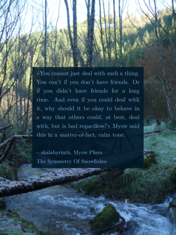
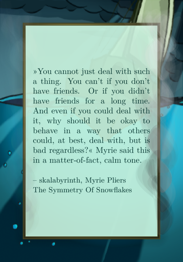
while the example 1 supplemented with the same text width and a background image
...
\def \cstxtwidth {15cm}
\def \csbackgroundimage{img/backgroundlr.jpg}
...
would result in this (Note: I scale every image to the same width for the homepage, it is not the original size.):

You see two issues here:
- You would need to choose another text width fitting the image size.
- You will need a color background behind the text to get some contrast.
Here is a simple example that works quite well:
...
\def \cstxtwidth {6.2cm}
\def \csbackgroundimage{img/backgroundlr.jpg}
\def \cssimpleshadow {x}
...
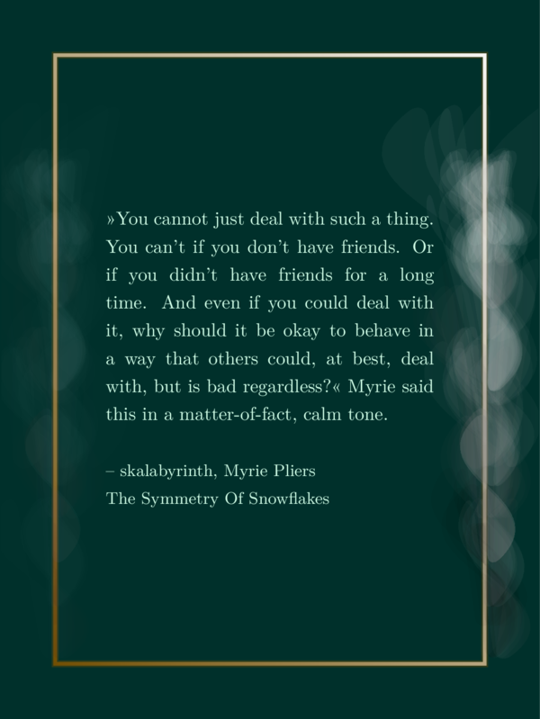
It results in this sharepic:
For most image backgrounds I would recommend the option \csframeshadow {} wich
is a shadow as large as as the image minus 1cm on each side, especially if you also choose a frame. But on that later.
At the moment I choose a resolution of 90dpi for background images, but that is pretty low. It is sufficient for my needs.
Shadows
There are three shadow types so far and since we will use shadows in the following a lot, I will just shortly describe the commands.
\cssimpleshadowcreates a shadow slightly larger than the text. It is basically a semi transparent filled rectangle in background colors. If you want to have a graphic behind the text (not the same as background image, see later), this is the shadow for you.\csblurryshadowcreates a shadow of the same size as the one before. It also is a semi transparent filled rectangle in background colors but with an additional blurry dark shadow around it. It is recommended for background images. (I wanted to have a blurry edge of that rectangle as well, but I wasn’t successful. I can’t work out, how to implement a blurry rectangle like the blue blurry example circle from the documentation. The command\tikzfadingmakes nonsense and using thetransparentoption results in fading to black instead of to transparent. If you have any idea, please help.)\csframeshadowcreates a shadow like that one before but in the size of a frame, if present or not. Meaning, it is as large as the image, minus 1cm on each side. It is also recommanded for background images, especially if you also use a frame.
Frames
By now frames might be one of the two main features of this software. There are the following options:
- A shiny frame:
\csshinyframe {}. - A massive frame:
\csmassivframe {} - An ornament frame:
\csornamentframe {} - Another ornament frame with corners:
\csornamentframecorners {} - And a footprint frame:
\csfeetframe {}
Shiny frame and massive frame:
The first two options are the easiest since there are not so many options to it. The
shiny frame is very light with some gradient. The massive frame is rather heavy, maybe
like a frame of a painting, and you should choose a bright color for \mgcolb for it
to look nice.
In the following image you see on the left the result with \csshinyframe {x} and on the right with \def \csmassivframe {x}:
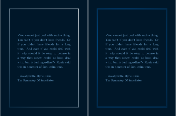
Using colors like yellow and beige or brown for \mgcol and \mgcolb you could get the impression of a golden frame with the \csmassivframe option.
Ornament frames
Ornament frames take ornaments from the pgfornament library and put them together to create a frame. There are ornaments for vertices and ornaments for edges. The edge of the frame consits of repeating edge ornaments.
You can set \csornamentedge{85} to choose for the edge ornament and \csornamentvertex{41} for
the vertex ornament.
You can use the extra options \csornamentrepeatx{4} and \csornamentrepeaty{4} to control the number
of edge ornaments used for an edge.
You can find a full list of possible ornaments with numbers in the file ornamentlist.pdf in the folder ‘docs’. If
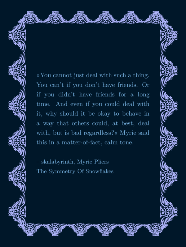
you want to joke around and use 6 owls for each edge of the frame (I chose another middle color for more contrast):
...
\def \mgcol {b2b7ff}
\def \csornamentedge{123}
\def \csornamentrepeatx{6}
\def \csornamentrepeaty{6}
\def \csornamentframe {x}
...
You would get this image:
More reasonable choices could be ornaments that are simpler and thin like this:
...
\def \csornamentedge{47}
\def \csornamentframe {x}
...
The folling image shows results of the code above with the following values for \csornamentedge:
Upper row, left to right: 47, 49, 84, lower row, left to right: 85, 87, 88.

Ornament frames with vertices pretty much work the same, except you also define a vertex ornament. The settings would look like this:
...
\def \csornamentvertex{41}
\def \csornamentedge{85}
\def \csornamentframecorners {x}
...
These settings (together with the example 1 settings for the whole section) create the following sharepic:

Concluding to ornament frames I want to show you a full example code of a sharepic that I actually use, with a background image you can download here:
\input {preamble.tex}
%
\def \csquote {»You cannot just deal
with such a thing. You can't if you
don't have friends. Or if you didn't
have friends for a long time. And even
if you could deal with it, why should
it be okay to behave in a way that
others could, at best, deal with, but
is bad regardless?« Myrie said this
in a matter-of-fact, calm tone.}
\def \csauthor {– skalabyrinth, Myrie
Pliers\\The Symmetry Of Snowflakes}
%
\def \cstxtwidth {5.0cm}
\def \cstxtspacing {1.2em}
%
\def \bgcol {0c2434}
\def \fgcol {a4b9c8}
\def \mgcol {b0c3d4}
\def \mgcolb {74a8fa}
%
\def \csbackgroundimage{mycode/sWASUSbg.png}
%
\def \csmassivframe {x}
\def \csframeshadow {x}
%
\def \csornamentedge{75}
\def \csornamentvertex{127}
\def \csornamentrepeatx{1}
\def \csornamentrepeaty{12}
\def \csornamentframecorners {x}
%
\input {montage.tex}
Footprint frames
Finally you can select a frame out of footprints. I used the tikz-library decorations.footprints. It
comes with the following options:
- bird,
- felis silvestris (meaning European wildcat),
- gnome,
- and human (which is the default, meaning, if you put any text other then the above words into the brakes, it will be human).
The example 1 code supplemented with this
...
\def \csfeetframe {human}
...
would result in the following sharepic:
All the others, left to right: bird, felis silvestris, and gnome, can be seen here:
Symbol or graphic behind the text
About
This section will be a bit different than the last. Instead of walking you through I will explain my intentions and how it went. I think it will give you a good idea of how it works and some ideas how I put this software together.
Graphic behind text
I started this project with the goal to more or less recreate a sharepic made with the software Canva in a slightly different and better way. The sharepic contained:
- text, story title and author,
- three similar abstract forms between drops and waves in golden colors (we will come to that later),
- a golden frame,
- behind the text, there was a dagger in a single color, partially behind a semitransparent green layer to contrast the text.
My first intermediate step was to extract the dagger from that sharepic with a color selection tool. I
cut it out, recolored it to the color before a semitransparent layer on top of it changed it, and at last
put it behind my text as an image. I will not show that result since I don’t know of license stuff. Next
step was to draw a dagger myself with krita where I have all the rights, and to put it behind text. (This
is the reason you will find dolch.png as a very unprofessional example graphic behind text in the folder ‘img’. Dolch
means dagger in German.) It
wasn’t beautiful, but here you go:
Example 1 code supplemented with this:
...
\def \csgraphic {img/dolch.png}
\def \cssimpleshadow {x}
\def \csshinyframe {x}
...
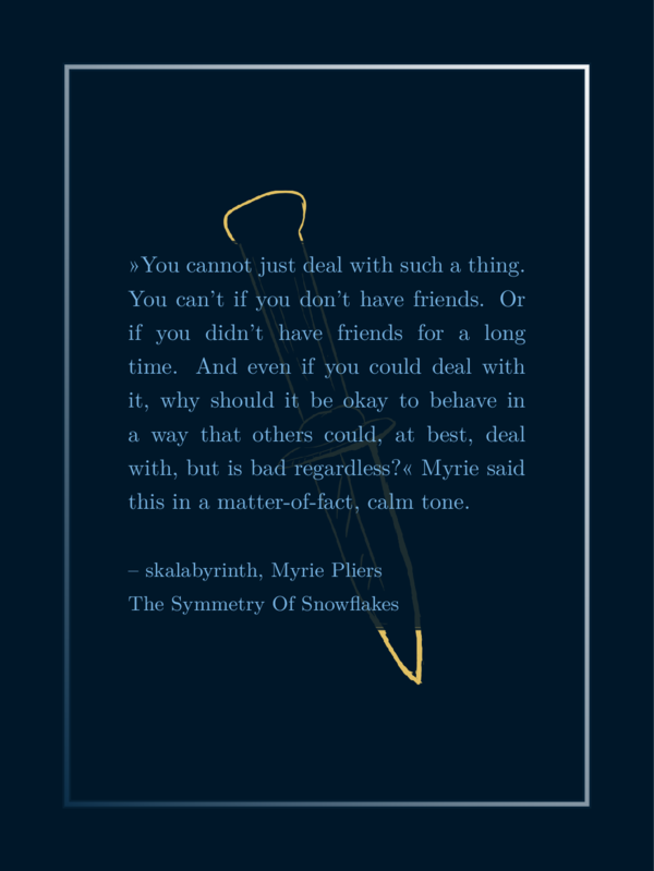
You see, you can use the option \csgraphic to select a graphic that appears
behind the text. Like with \csbackgroundimage you may write a path to
an image into the field instead of just a cross or anything. In contrast
to \csbackgroundimage the option \csgraphic does not affect the size
of the image and there is an option to control the size of that image:
\def \graphicSize {8cm}
8cm is a good choice for citations that are not extremely long, so it is the default.
Unicode symbols behind text
The graphic behind the text is monocolored and that gave me an idea: There is an
emoji dagger and there are black and white emoji fonts (but as I would realize, not
easy to find). My idea was, to have an option where you can put unicode symbols
behind the text, that are monocolored emojis. That was a journey of several
hours research and without a simple satisfying solution. (That was the point where
I decided to use lualatex instead of pdflatex as compiling tool, which seemed to
be promising with regards to more fonts and symbols but didn’t help in the
end. I still sticked to lualatex since it is closer to the SPBuchsatz-setup.)
First of all, you actually can put unicode symbols behind the text, – only if the font has those –, like this:
...
\def \csbgsymbol {†}
\def \mgcol {e1c062} % light yellow color
\def \csbgsymbolangl {20}
\def \cssimpleshadow {x}
\def \csshinyframe {x}
...
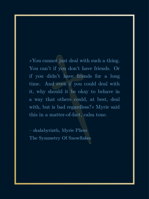
The field \csbgsymbol can contain a copy pasted unicode symbol that you would
like to have behind the text. There are not many that work since the LaTeX fonts I
found won’t have that many. In fact I only found the these three apart from letters:
†, ‡ ∢.
The first one is called ‘dagger’ and since a dagger was an option I wanted, I kept that part of the code.
The field \csbgsymbolangl rotates that symbol by degrees where 360 is a full rotation and it goes
counterclockwise.
The other fields where explained before.
TikZ and Marvo symbols behind the text
My research went on. My goal was still to find a possibility to use another font for unicode symbols with a complete set of monocolored emojis. I know such a font from Minecraft, but that most likely isn’t an open font and also I don’t know how to import it into LaTeX.
While searching for my preferred solution I stumbled across two libraries that contain nice symbols:
- marvosym (documentation for marvosym),
- tikzsymbols (documentation for tikzsymbols).
Both come with commands like \Coffeecup which creates a symbol representing its
name. You can use that command instead of a copy pasted symbol like
this (same code as above, just exchanged the
dagger symbol for the \Coffeecup-command):
...
\def \csbgsymbol {\Coffeecup}
\def \mgcol {e1c062} % light yellow color
\def \csbgsymbolangl {20}
\def \cssimpleshadow {x}
\def \csshinyframe {x}
...
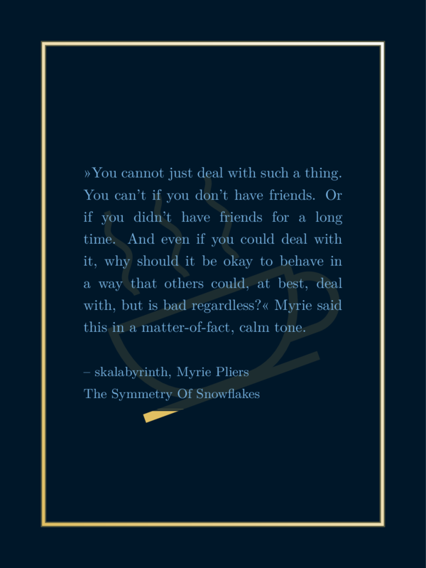
There are several symbols. You might look into the documentation for a full list. But here are some that I assumed most useful:
From the MarvoSym library, left to right: \Football, \Bicycle, \Moon, \Mercury (and
the other planets), \Mundus and \Bat.

And from the TikZSym library, left to right: \Heart, \Candle, \Coffeecup, \Fire, \Tribar, \Snowman.

Musical Symbols behind the text
I tried to work on another ToDo and come back to my symbols journey later: I wanted to have musical symbols decorating the sharepic. But I realized, musical symbols are also nice for symbols behind the text.
So I loaded the musicography library which contains quartes, eighth, keys and so
on. But the violin key and the bass key weren’t just commands. See musicography
documentation for
details. I implemented a reasonably sized violin and bass key based on that library so
you can have a sharepic with these keys as symbol behind the text.
...
\def \csbgsymbol {\musViolinKey}
\def \mgcol {e1c062} % light yellow color
\def \cssimpleshadow {x}
\def \csshinyframe {x}
...
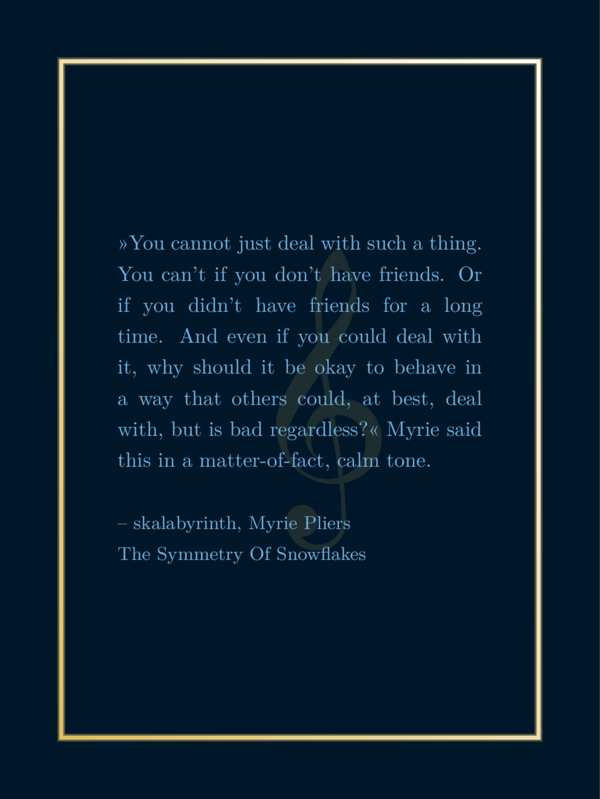
Again a selection of useful symbols from the musicography
library, left to right: \musFlat, \musSharp, \musNatural, \musWhole, \musHalf, \musQuarter, \musEighth, \musHalfDotted, \musQuarterDotted, \musViolinKey, \musBassKey.

Advanced trick: If you want to have another symbol like a key that wouldn’t just work with a simple
command, you might have a look into preamble.tex. For example I used this code line to create the \musViolinKey command:
\NewDocumentCommand{\musViolinKey}{}
{\musSymbol{0.955em}{0.55ex}{0pt}{\symbol{71}}}
I modified a copied line from the documentation to optain it. You could try a similar command declaration there with other numbers to define your own command.
However: With each new download of the software you would need to modify the preamble.tex file again. If
you created your desired symbol please feel free to send me that line and I will add it to the code
permanently. (Same goes for ornament symbols, explained in a bit.)
Ding symbols behind the text
I returned to the idea if it might be possible to find some emoji symbols, to find a font that works with LaTeX with symbols. I was unsuccessful, I even was able to use a noto font with emojis but they where colored like in chats and I didn’t like it. The font dejavu has some emojis implemented in monocolor but just smilies.
But I stumbled across the pifont with the command ding. At least there are some nice
unicode symbols that you can access with it.
The code would look like this:
...
\def \csbgsymbol {\ding{73}}
\def \mgcol {e1c062} % light yellow color
\def \cssimpleshadow {x}
\def \csshinyframe {x}
...
I don’t like this implementation not that much because you need to look into a table, wich number belongs which symbol and then you have a command inside a command in the definition file. I wanted to have this software as simple as possible. But it is how it is. Here is a list of useful symbols:
- pens: 46: ✎, 47: ✏, 48: ✐, 49: ✑, 50: ✒,
- symbols with a symmetry of four: 66: ✢, 67: ✣, 68: ✤, 69: ✥, 70: ✦, 71: ✧,
- five-pointed stars: 72: ★, 73: ✩, 74: ✪, 75: ✫, 76: ✬, 77: ✭, 78: ✮, 79: ✯, 80: ✰,
- stars with more spikes/suns: 82: ✲, 83: ✳, 84: ✴, 85: ✵, 86: ✶, 87: ✷, 88: ✸, 89: ✹, 90: ✺,
- other star like forms: 91: ✻, 92: ✼, 93: ✽, 94: ✾, 95: ✿, 96: ❀, 97: ❁, 98: ❂, 99: ❃,
- snowflake like forms: 100: ❄,101: ❅,102: ❆,103: ❈,104: ❉,105: ❊,106: ❋,107: ❇.
You can find more ding-symbols on wikipedia.
Conclusion to symbols behind text
You see, with the command \cssymbol you can put symbols behind your text. But for different
types of symbols you use different input. This is how the three different notations look:
\def \cssymbol{†},\def \cssymbol{\Coffeecup}or\def \cssymbol{\musViolinKey},\def \cssymbol{\ding{73}}.
But there is more: ornament behind the text
As there are many beautiful symbols in the ornament library (which I introduced in
the frame section), I didn’t hesitate to try these in a similar way I used the music
symbols behind the text. The idea was, that
you might use the \cssymbol field even for that. But that didn’t work out
so well. The code behind \cssymbol scales a symbol, which looks good. But
when you scale an ornament in the same way, the outline becomes very thick
and it does not look good. So I needed to implement another way to
scale the ornaments which is intended for this type of graphics.
Similar to the musical notations I declared new commands for the ornament symbols
in the preamble. You can use code like this:
...
\def \csornament {\ornWatch}
\def \graphicSize {5cm}
\def \mgcol {e1c062} % light yellow color
\def \cssimpleshadow {x}
\def \csshinyframe {x}
...
You might have noticed that I added the line \def \graphicSize {5cm} to the code. The
graphic size affects the ornament and determinds its width.
Also here an image of all implemented ornament symbols for the \csornament option, left to right:
\ornLeaf, \ornWildRose, \ornWildFlower, \ornOldFlower,
\ornDove, \ornButterfly, \ornOwl, \ornBird, \ornFish, \ornHorse, \ornBlackHorse
\ornShoe, \ornQuill, \ornWatch, \ornShip, \ornTophat, \ornHat.

Advanced trick: If you want to have another symbol from the ornament library, like
let’s say, the pig, you might have a look into preamble.tex. For example I used this code line to create the \ornLeaf command:
\NewDocumentCommand{\ornLeaf}{}
{\pgfornament[color=mgcol,width=\graphicSize]{1}}
You can have a look into the file ornamentlist.pdf in the folder ‘docs’, look up the number of
your preferred ornament, let’s say the pig at number 111, and add the line:
\NewDocumentCommand{\ornPig}{}
{\pgfornament[color=mgcol,width=\graphicSize]{111}}
You then have successfully implemented the command \ornPig and can use it in \csornament.
However: With each new download of the software you would need to modify the preamble.tex file again. If
you created your desired symbol please feel free to send me that line and I will add it to the code
permanently.
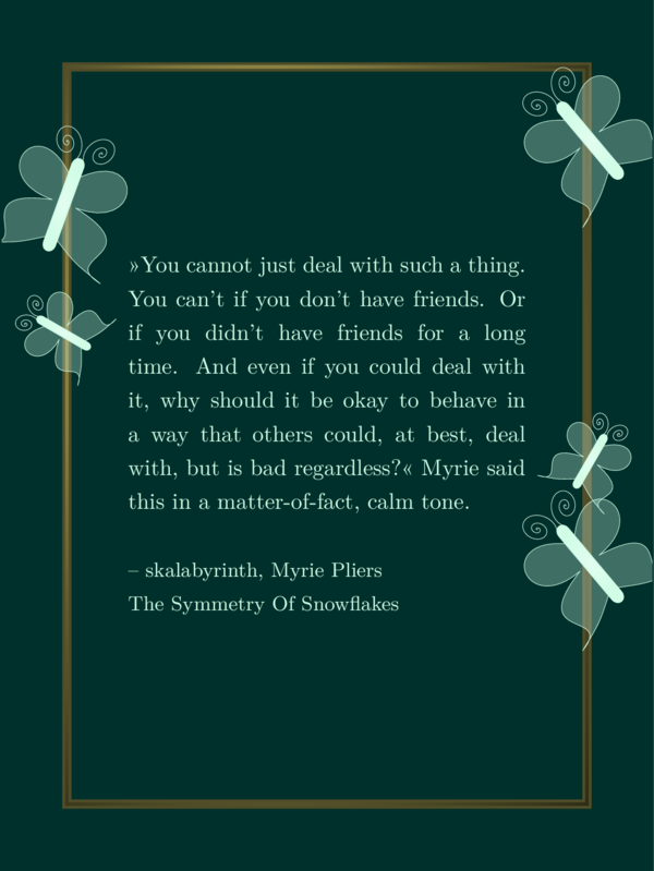
Advanced: Custom decoration behind the text
If you feel like you want to code yourself you can copy any file from the folder decorations to your own
folder (for example ‘mycode’) and modify it. There are some files dedicated for that purpose
already: You could for instance copy the file cscustomsymbolbehindtext.tex to your folder mycode
and load it in your sharepic like this:
...
\def \cscustomdecorationbehind {mycode/cscustomsymbolbehindtext.tex}
\def \cssimpleshadow {x}
\def \csshinyframe {x}
...
This would result in this sharepic:
The file cscustomsymbolbehindtext.tex contains:
% A custom symbol behind the text: work in progress.
% The coordinates should not be dependent on the corners
% *** A butterfly behind the text ***
% #1: coodinates of center
% #2: size (approximately)
% #3: angle
% #4: color
% #5: left or right
\butterfly{5.0cm,-7.0cm}{5.5}{40}{green!80!white}{left}
All lines starting with a % are comments, meaning, they do not have any affect on the
generated output. It is just explanation. Meaning, it is a single code line:
\butterfly{5.0cm,-7.0cm}{5.5}{40}{green!80!white}{left}
You could change color, size, angle, and so on and create your own custom background symbol behind the text. You can copy and paste other lines from other files in the folder ‘decorations’ there. If you work in your own copies in your own folder, you even don’t lose your implementations when downloading a new version while keeping that folder.
If you create a nice file, feel free to send it to me and I would probably put it into the code with credits if you like.
Side note: This example of a custom code is a work in progress. I want to implement the possibility to use the decorations from the next section as graphic behind the text as well. This is not a reasonable implementation so far, since it should be centered and not shifted to the middle of the sharepic from the upper left point. Most likely I would implement another option ‘center’ for the last curly brakes of the butterfly command.
Example code 2
For all following examples I will also use the same quote and author field. For foreground decorations I will use different colors than before: a blue-green as background, a very light green as foreground and shades of brown and dark yellow for medium colors to show a gold effect.
See those colors in the following image:

I sometimes will switch background and forground colors to demonstrate these effects on the decoration.
Here are the settings:
\input {preamble.tex}
\def \csquote {»You cannot just deal
with such a thing. You can't if you
don't have friends. Or if you didn't
have friends for a long time. And even
if you could deal with it, why should
it be okay to behave in a way that
others could, at best, deal with, but
is bad regardless?« Myrie said this
in a matter-of-fact, calm tone.}
\def \csauthor {– skalabyrinth, Myrie
Pliers\\The Symmetry Of Snowflakes}
\def \bgcol {00302b}
\def \fgcol {d1fde7}
\def \mgcol {724f03}
\def \mgcolb {c8c065}
...
% additional options
...
\input {montage.tex}
I will refer to it as example 2. The additional options, I will be talking about in the following, come
where you read % additional options in the code block above.
Foreground decoration
Foreground decoration are like the symbols behind the text, but intended to be
foreground symbols. They are less shy, more sparkly and detailed, some of them
have more than one color. Some of them like the butterfly I implemented myself
with just commands for curves and fill options with the library TikZ. TikZ
is kind of a programming language to implement vector graphics in a very readible
way and I love it very much.
But this is a documentation on how to use CiteSeeing and not so much about the code behind it. In this section I present to you all foreground decorations.
Sparkles
There are (so far) three types of sparkles:
\cssixsparkles: recommended for dark background,\cssixdaysparkles: recommended for light background,\cssixlightsparkles: also recommended for light background, but okay for dark backgrounds, too.
You can use it like this:
...
\def \csshinyframe {x}
\def \cssixsparkles {right}
...
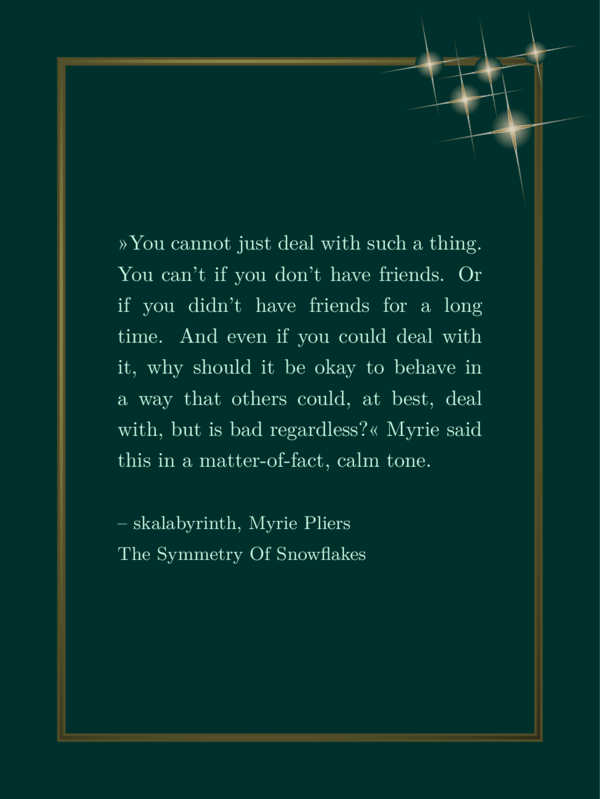
(It makes more sense with a frame but also works without.)
As you see, I didn’t just select it with an ‘x’, but wrote ‘right’ into the field. If you write anything into that field apart from ‘right’, the sparkles will appear on the left – it is the default. (Maybe I will add more options in future, but sparkles seem to look better top right or top left than at the bottom.)
The following image shows the output of all three sparkle variations on the right with a shiny frame:
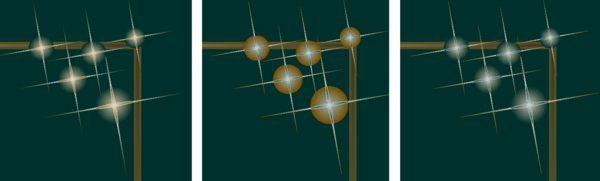
The right and left sparkles look nice in my opinion. Maybe the right ones may look a bit fragile. But the middle sparkles are supposed to look good on lighter backgrounds. See the demonstration here:
The code
...
\def \fgcol {00302b}
\def \bgcol {d1fde7} % switched foreground and background colors
\def \csshinyframe {x}
\def \cssixdaysparkles {right}
...
generates this sharepic:
The following image shows the output of all three sparkle variations on the right with a shiny frame and switched background and foreground color:
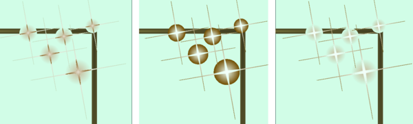
You see, the middle option fits the light color theme quite well. The last one also looks nice. But the first one has too dark colors, the sparkles do not really shine bright.
Side note 1: Maybe you counted only five sparkles while the option claims there were six. Well, I miscounted and I couldn’t decide how to fix this. I could add another sparkle or change the name of that option. So it stayed like it is.
Side note 2: You may remember from the section about shadows, that I don’t know how to use fading to transparency in TikZ. That is still true. If you look closely, the shimmering white color in the circle behind the stars fades to the background color instead. You can see it where the sparkles intersect with the frame: The circle is above the frame. I think it still looks nice, but if you find an option to change it to real transparency, let me know.
Concluding to the sparkles section I want to show you a full example code that is very similar to a sharepic that I actually use, except for the colors. The colors are the same as before, with background and foreground color switched. Find the background image for the following setup here:
\input {preamble.tex}
%
\def \csquote {»You cannot just deal
with such a thing. You can't if you
don't have friends. Or if you didn't
have friends for a long time. And even
if you could deal with it, why should
it be okay to behave in a way that
others could, at best, deal with, but
is bad regardless?« Myrie said this
in a matter-of-fact, calm tone.}
\def \csauthor {– skalabyrinth, Myrie
Pliers\\The Symmetry Of Snowflakes}
%
\def \cstxtwidth {5.0cm}
\def \cstxtspacing {1.2em}
%
\def \fgcol {00302b}
\def \bgcol {d1fde7}
\def \mgcol {724f03}
\def \mgcolb {c8c065}
%
\def \csbackgroundimage{mycode/sDFDMbg.png}
%
\def \csmassivframe {x}
\def \csframeshadow {x}
%
\def \cssixdaysparkles {right}
%
\input {montage.tex}
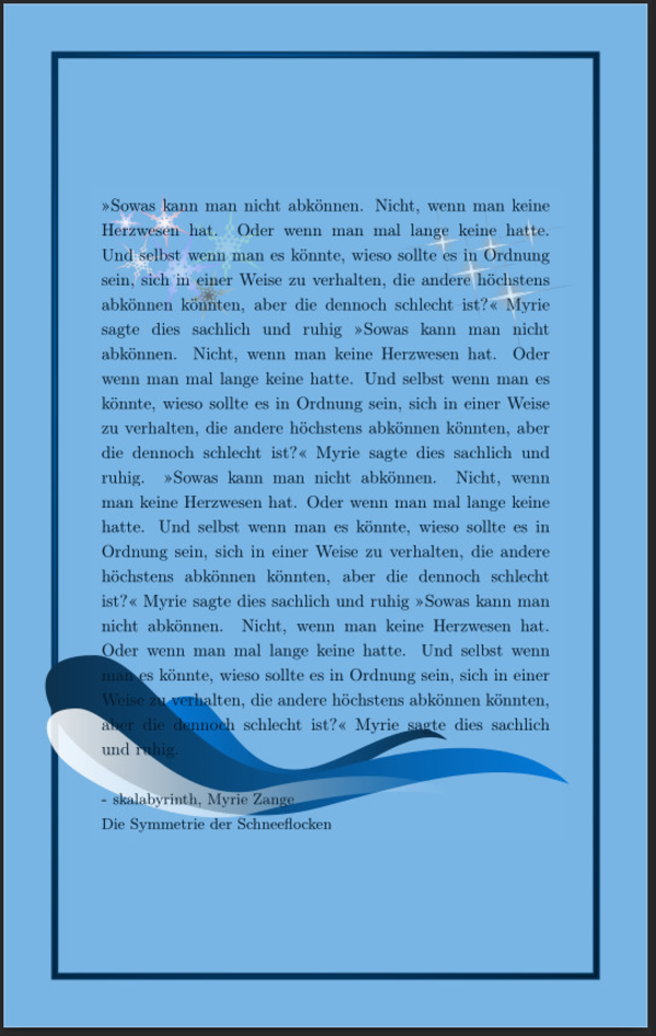
Snowflakes
Snowflakes work in a similar way to sparkles, but there is just one variant:
...
\def \cssixsnowflakes {left}
...
Together with the example 2 this creates the following sharepic:
They maybe look best on a blue-ish color scheme like demonstrated in the beginning of this article.
Short excursion into the code
I kept most of the code from you so far and want to make an exception here, since this example
demonstrates quite well what TikZ is capable of, and how I work with it.
You can find the code for the snowflake generation in the file ‘snowflakes.tex’ in ‘src’ (which is short for source code).
The heart of the code may be these lines:
\shade[
	inner color=#5,
	outer color=#6,
	shading=radial,
	opacity=#7,
	even odd rule
	]
	% starts from the outer vertex of the star at t angle
	   ($(ms) + (\angl+0*360/6:\rado) $)
	% goes to the inner vertex next to it
	-- ($(ms) + (\angl+0*360/6+180/6:\radi)$)
	% repeats it for all outer vertexes of the snowflake
\foreach \p in {1,...,5}
{
	-- ($(ms) + (\angl+\p*360/6:\rado) $)
	-- ($(ms) + (\angl+\p*360/6+180/6:\radi)$)
}
% closes the shape.
-- cycle
% four circles intersecting the star at four differend distances.
(ms) circle (\radi+0.1*\rado)
(ms) circle (\radi+0.2*\rado)
(ms) circle (\radi+0.3*\rado)
(ms) circle (\radi+0.4*\rado);
I will walk you through and the following image might provide some vizualization:
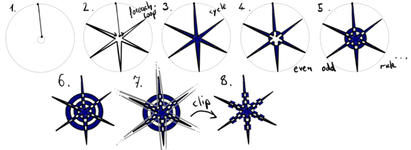
With \shade you define, that the path you declare after that will
have a gradient filling. I chose radial and inner and an outer color, which
leads to a shape that is filled with the inner color in its middle, which
changes to the outer color to the outside.
I defined (ms) as coordinates for the center of the snowflake. We start
drawing a six pointed star from the tip of one spike. To do so, we add
the outer radius for the circle, the tip of all spikes lay on, onto
(ms), in the direction of a given angle.
($(ms) + (\angl+0*360/6:\rado) $)
The notation (angle:distance) defines a vector of length distance in
the direction, the angle points to.
From that tip we go to an inner edge. All inner edges lay on a circle
with an inner radius which I called radi. We also need to add 180°/6 to
the angle before, since a snowflake has a symmetry of six.
-- ($(ms) + (\angl+0*360/6+180/6:\radi)$)
The letters -- connect the last point to the next.
Then we repeat this procedure for the other 5 spikes rotated by a sixth of 360° with a for loop:
\foreach \p in {1,...,5}
{
	-- ($(ms) + (\angl+\p*360/6:\rado) $)
	-- ($(ms) + (\angl+\p*360/6+180/6:\radi)$)
}
The \foreach command repeats everything in the following curly brakes
as for each element in the set, in this case {1,...,5} which is short
for {1,2,3,4,5}. In this loop we can use the variabel \p which
will have values 1 to 5.
Meaning the code postet just before is short for:
	-- ($(ms) + (\angl+1*360/6:\rado) $)
	-- ($(ms) + (\angl+1*360/6+180/6:\radi)$)
	-- ($(ms) + (\angl+2*360/6:\rado) $)
	-- ($(ms) + (\angl+2*360/6+180/6:\radi)$)
	-- ($(ms) + (\angl+3*360/6:\rado) $)
	-- ($(ms) + (\angl+3*360/6+180/6:\radi)$)
	-- ($(ms) + (\angl+4*360/6:\rado) $)
	-- ($(ms) + (\angl+4*360/6+180/6:\radi)$)
	-- ($(ms) + (\angl+5*360/6:\rado) $)
	-- ($(ms) + (\angl+5*360/6+180/6:\radi)$)
And at last we close that path with a --cycle command which connects the last
point with the first in the path.
This would now be just a simple six-pointed star, nothing more.
Now the magic happens, that transforms the star into a snowflake:
(ms) circle (\radi+0.1*\rado)
(ms) circle (\radi+0.2*\rado)
(ms) circle (\radi+0.3*\rado)
(ms) circle (\radi+0.4*\rado);
The semicolon in the end finishes, what is affected by the shade command. I
used the option even odd rule, which means, the first closed shape is filled,
the next, is also filled, but where it intersects with the shape before, it is
unfilled, and so on. I put four circles with growing size on top of the star.
This produces a very interesting pattern like this:

At last we draw another six-pointed star on top of all this and use it as a shape to cut the whole thing, and we get the snowflakes that are more transparent than the others.
	\clip[]
		% starts from the outer vertex of the star at angle
		   ($(ms) + (\angl+0*360/6:\rado*\clipr) $)
		% goes to the inner vertex next to it
		-- ($(ms) + (\angl+0*360/6+180/6:\radi*\clipr)$)
		% repeats it for all outer vertexes of the snowflake
		\foreach \p in {1,...,6}
		{
			-- ($(ms) + (\angl+\p*360/6:\rado*\clipr) $)
			-- ($(ms) + (\angl+\p*360/6+180/6:\radi*\clipr)$)
		}
		% closes the shape.
		-- cycle;
For those, that look a bit brighter, we put another less transparent star on top.
Side note: The code has some repeated lines. This could be coded more elegantly if I knew how to define shapes and such. But I have neither brains nore nerve to make it better. It is okay, I guess.
Butterflies
I implemented a method to put a butterfly somewhere. You can have one:
...
\def \csbutterfly {right}
...
Or, if you would like them to sit on your frame, there is this possibility:
...
\def \csmassivframe {x}
\def \csbutterfliesonframe {x}
...
You may notice that this takes a little longer to produce the output file. The antenna are expensive, I guess.
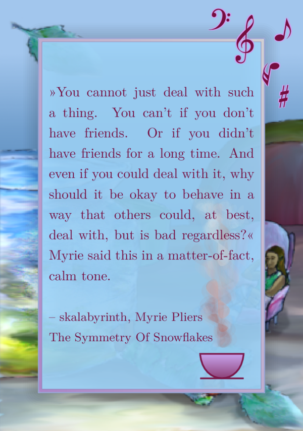
Music notes
The main reason I loaded the musicography library was to decorate the frame with musical notes. I took symbols from there, placed some of them and tried to find a good looking collection. I use the foreground and medium colors to create notes with a shadow.
Here is an example together with the shiny frame:
...
\def \csshinyframe {x}
\def \csmusnotes {right}
...
There is an option to have them on the left as well.
Smoke and steam
The first user request was smoke. This was not easy, I’ll admit it, but I am quite happy with the result.
There is smoke and strong smoke, steam and strong steam, that you can put left or right, or – special feature here – on both sides!
I created strong smoke, since there are cases where more contrast is neaded, for example the case of a background image.
This code supplementation of the example 2:
...
\def \csshinyframe {x}
\def \cssmoke {left}
\def \csstrongsmoke {right}
...
would lead to this image:
Maybe you agree that the smoke on the left side looks more or less natural while the strong smoke on the right side is not nice at all. Maybe you wonder where this might even look okay.
Let us switch background and foreground color and add a background image:
...
\def \fgcol {00302b}
\def \bgcol {d1fde7}
\def \csbackgroundimage{mycode/sDFDMbg.png}
\def \cstxtwidth {5.0cm}
\def \cstxtspacing {1.2em}
\def \csframeshadow {x}
\def \csmassivframe {x}
\def \cssmoke {left}
\def \csstrongsmoke {right}
...
Now the result looks like this:
The same goes for steam.
The image shows the same results as before with steam. I used nearly the same code but I exchanged all appearances of ‘smoke’ with ‘steam’, and I used the massiv frame in both cases.
Cup with steam
Since there is steam now, and I really like tea, I added a cup with steam. I couldn’t use
the \Coffeecup from the tikzsymbol-library since that already has steam represented with
three curved lines. Also I wanted to have a filled cup.
You can use my creation with this code:
...
\def \csmassivframe {x}
\def \cscupwithsteam {x}
...
Since we run into the same issue with a light or busy background, there is another version of that cup where the outline uses another color (the foreground color) and the steam is strong steam. I demonstrate it with switched background and foreground color:
...
\def \fgcol {00302b}
\def \bgcol {d1fde7}
\def \csmassivframe {x}
\def \csdaycupwithsteam {x}
...
Another example I use
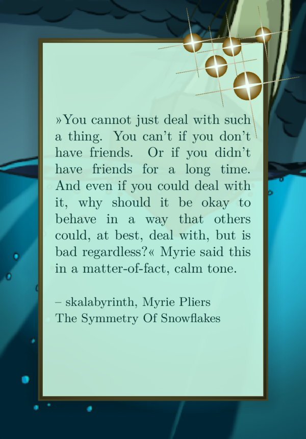
At this point I can show you another example, I actually use for sharepics. I use the music note decoration, since the topic of that novel is the participation in a music festival. And I used that cup with steam since there is lots of cozyness with drinking warm tea and such. You can download the background image of the novel here.
The setup is the following:
\input {preamble.tex}
\def \csquote {»You cannot just deal
with such a thing. You can't if you
don't have friends. Or if you didn't
have friends for a long time. And even
if you could deal with it, why should
it be okay to behave in a way that
others could, at best, deal with, but
is bad regardless?« Myrie said this
in a matter-of-fact, calm tone.}
\def \csauthor {– skalabyrinth, Myrie
Pliers\\The Symmetry Of Snowflakes}
%
\def \cstxtwidth {5.3cm}
\def \cstxtspacing {1.5em}
%
\def \bgcol {a2d9ff}
\def \fgcol {760d3f}
\def \mgcol {cea0ef}
\def \mgcolb {cea0ef}
%
\def \csbackgroundimage{mycode/sWENPbg.png}
%
\def \csshinyframe {x}
\def \csframeshadow {x}
\def \csmusnotes {right}
\def \csdaycupwithsteam {x}
\input {montage.tex}
and it generates this output:
Three waves
The first decoration I implemented were the three waves. Or whatever I might call them. An abstract form that looks like a mixture of a droplet rotated by 90° and a wave. It was a shape similar to one I saw in a Canva sharepic. And it was pretty interesting to implement that shape.
First, have a look at it:
...
\def \csmassivframe {x}
\def \csthreewaves {x}
...
This is basically all there is to that decoration on the surface.
(Side note: The third wave fades to transparency, which I claimed before, I wouldn’t be able to achieve. This is a different case here: It is a fading from left to right. I can’t find a way to fade radial oder in a direction other then north, south, east or west.)
If you are interested in the way it is built, you might enjoy a look at this image:
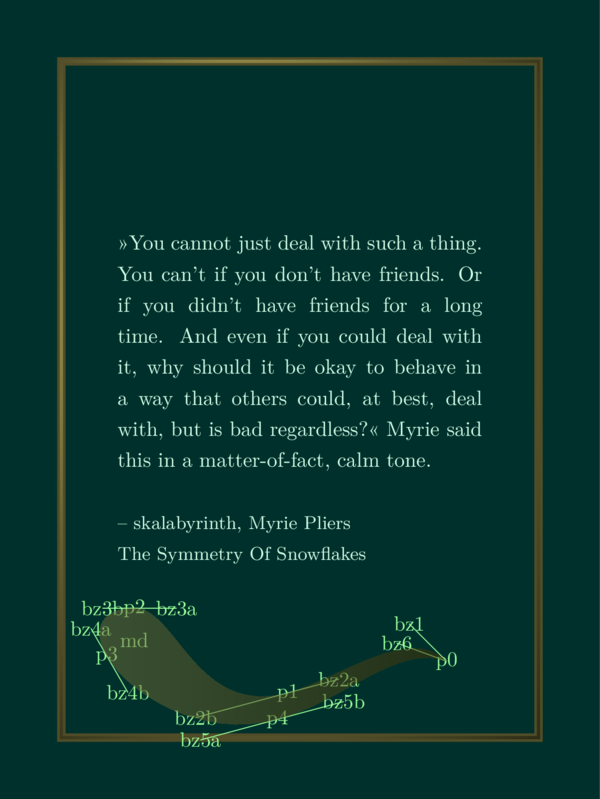
Here you see The five points and the tangents at these points defining the shape. It is a bézier curve.
With these helping lines you can play around with the code if you like to.
Custom foreground decoration
I achieve this image copying the file cscustomwaves.tex from the folder ‘decorations’ to my
own folder ‘mycode’ and then changing the supplementing settings to this:
...
\def \csmassivframe {x}
\def \cscustomdecoration {mycode/cscustomwaves.tex}
...
The file cscustomwaves.tex basically contains one line that isn’t a comment:
\decodrophelp{(b.south west) + (7.6cm,2.35cm)}{-3.0cm,-0.8cm}
{-5.9cm, 0.4cm}{0.60cm}{mgcolb}{mgcol}{0.3}{0.9}{}
If you would write \decodrop and omit the help you would get the same shape
without the annotations.
You can play around with any decoration copying the corresponding file to
your own folder and loading it with the \cscustomdecoration command. The
files in the folder ‘decorations’ that contain the word custom are predestined
to be used like this. For more details have a look into the section about custom
background decorations. These two commands work the same just with the
difference, that background decorations go behind text, frame and shadows and
foreground decorations go above of all that.
Tiny book and cover
Finally! The last decoration I implemented was the tiny book cover or tiny book. You can scale the cover of your book to a tiny image and put it onto your sharepic like this:
...
\def \csmassivframe {x}
\def \cstinybook {img/tinycover.png}
\def \cstinybookcoverangl {-5}
...
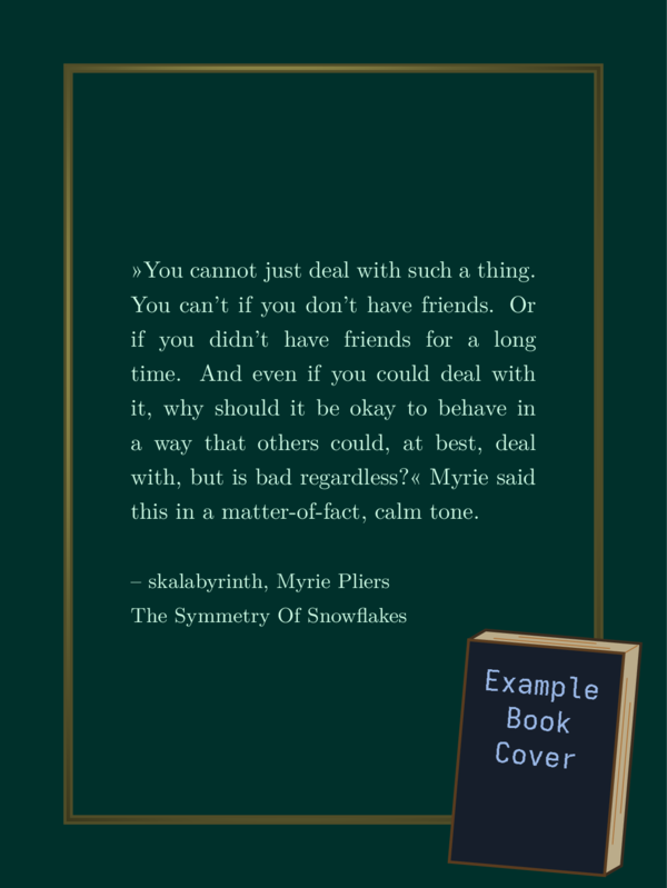
You can use the image tinycover.png in the folder ‘img’ as an
orientation, so you can scale your cover in a similar manner.
You can choose another angle if you like.
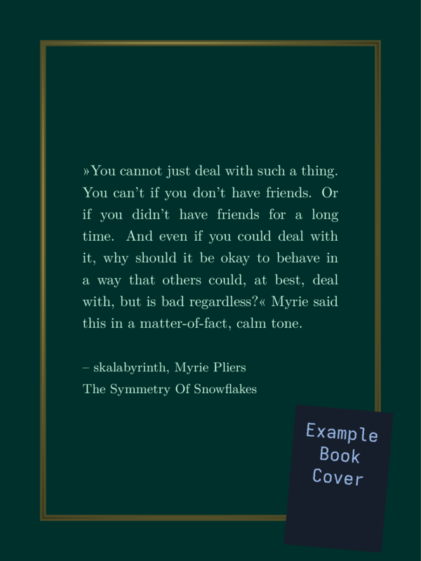
If you use \cstinycover instead of cstinybook, the result looks like this:
Instead of conclusions
I’m done. I hope you had at least a little fun or it was in another way helpful. Instead of a typical conclusion I will show you some outtakes while coding this thing.
When I learned to use bézier curves properly:
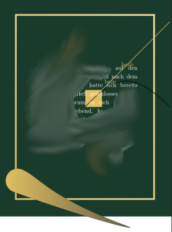
You see a light yellow square, that I often draw somewhere to see, if I am drawing at all. Then a yellow straight line to the north east. Two points along this line have names beza and bezb. And then there is a black line. I most likely drew it from the point, where the yellow line starts, to a point on its left. But I said, lean a little towards beza and bezb. So the black line made a curve to get to that point on the right.
On the bottom you see a droplet like form that has no wave in it yet. Also it leaves the green background and the image isn’t clipped to the background image, meaning, there is a white bar at the bottom of the sharepic.
Little did I know than. I learned a lot about bézier curves and clipping in the next hours of coding.
You also see that I blurred parts of the text and the background. I used text and a graphic back then, that I have no rights to.
When I realized that I used absolute coordinates instead of relative
At some point after I implemented the sparkles, snowflakes and wave shapes, I realized that I used absolute coordinates to determine the place to put them. Having an absolute size is not that bad, since the text should not become too wide. If the text is readible the sizes are large enough and the other way around. But if the text is too long (I copied my favorite quote several times to create a long text), it does play a roll, where the shapes are put. They need to be placed relative to the frame.
So I corrected that issue.
When I tested different color schemes

I just wanted to find out if my decorations also work well on light color schemes. The sparkles, I implemented first, do not. But the three waves actually do, I think, even with this horrible color scheme!
It is such a horrible sharepic that I somehow wanted to share it for giggles.
The sun
This actually isn’t a failure:

I implemented the spikes in a way that allows you to choose the amount of them. You actually can use the code for the sparkles to create sparkles with more than four spikes like this:
% *** SIX SPARKLES ***
% #1: coodinates of center
% #2: number of vertices
% #3: inner radius: the radius of the circle where the inner vertices are placed.
% #4: outer radius, see above.
% #5: start angle: where the first outer vertex is placed from the center.
% #6: color
% #7: background color: transparency isn't easily provided by TikZ's shading library.
% #8: left or right
\sparkle{2.5cm,-2.2cm}{17}{0.045}{0.45}{10}{mgcol}{bgcol}{right}
The second field is for the number of spikes. You can use different colors and so on. Have fun playing with it, if you like, using custom background or foreground decoration.
The End
And now I leave you to it.